Vode received CGI visuals of 40+ products in time for their website revamp.
Tight deadlines and shorter time to market for new releases and product updates meant that Vode needed to future-proof their product visuals.
A website revamp called for visuals that match Vode's minimalist, innovative brand.
We created CGI visuals for 40+ products in a few months - just before the new website launch.
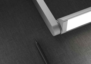
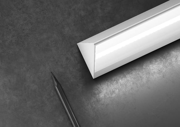
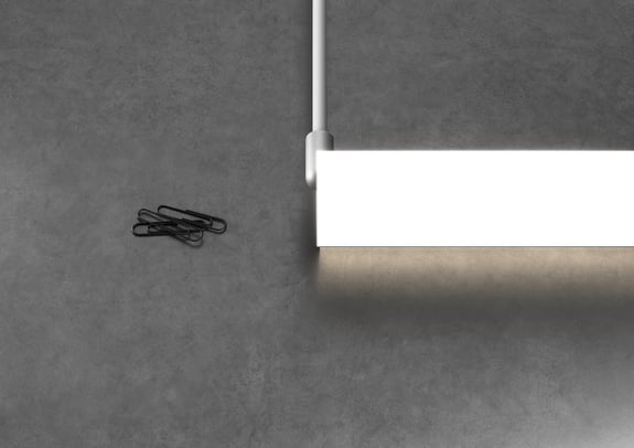
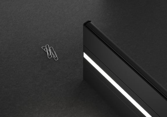
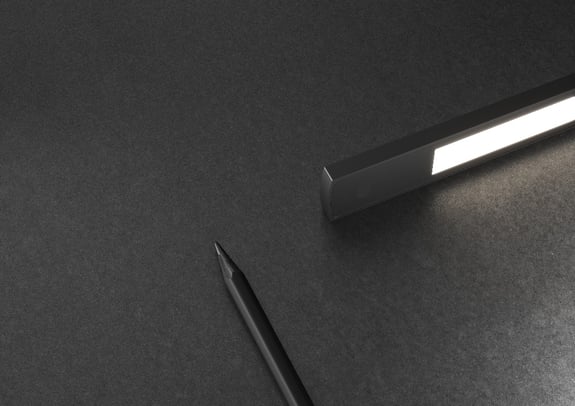
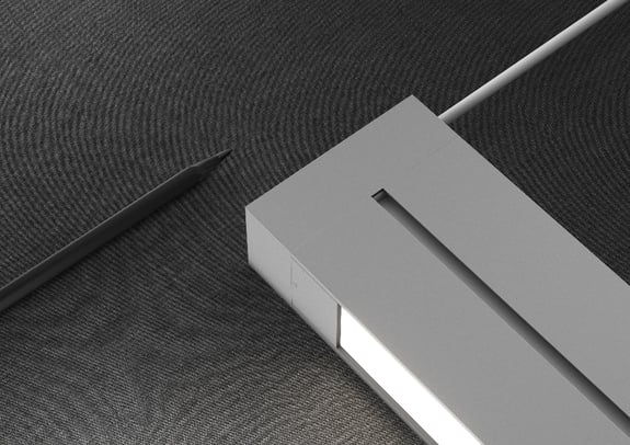
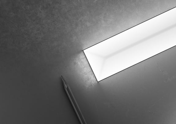
To showcase the small size and high quality of Vode's products, an Emotion & Scale concept with everyday items was created,
Company: Vode
Industry: Architectural lighting
Country: United States of America
Website: Check out their website
"We needed our visuals to evolve at the same pace as our products"
Historically, Vode has launched a new product and a product update each year, but things are changing. The company is now launching new product families and updates at much shorter intervals.
At the same time as juggling with an ambitious time-to-market strategy, Vode realized that the website needed a revamp to improve customer experience, making it easier for visitors to understand who Vode is and quickly find the information they need. However, they also needed new visuals to create the perfect online universe for their products that complemented the sleek, minimalist Vode brand.
Melanie Sanders is the Marketing Manager at Vode, and she's been an integral part of this journey.
“Historically, we have relied on traditional photography for our product images, but to streamline our processes and future-proof our product images, we decided to add CGI and 3D renderings to our plans for adaptability. Our products evolve continuously, and we are beginning to look years into the future when planning updates and new releases. So, instead of taking new photographs with each update, it's possible to return to the original renderings and make the necessary changes. It's so easy and very versatile," says Melanie Sanders and continues:
"In addition, we often work with very tight deadlines before product launches, and with 3D renderings, we can create the product images using STEP files before manufacturing the actual product. That saves us a lot of time, and it's also more sustainable than having to manufacture a product sample just for photo purposes. And sustainability is an integrated part of Vode."
New images for each and every product
Vode was fully prepared to embark on their CGI journey, and fortunately, we were highly recommended as the perfect partner for their endeavor.
The revamped website was on its way, and there was no time for dallying. Therefore, the initial project was comprehensive, to say the least.
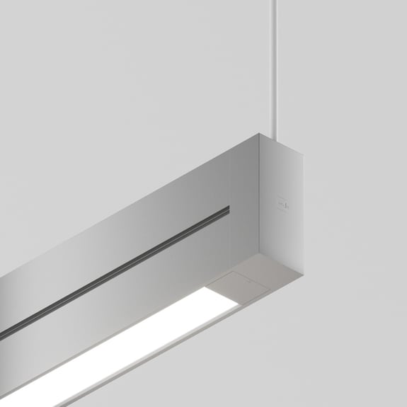
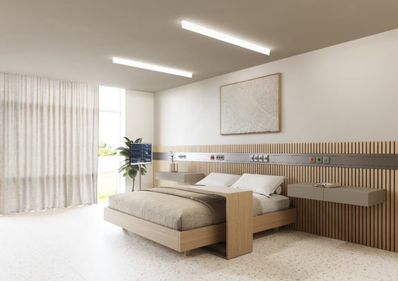
"We kicked things off with a massive project: Cadesign had to render every single one of our products on the market at the time—more than 40 different variants, including some lifestyle images where the products are seen in action.
On top of that, Cadesign developed these incredible Emotion and Scale images with a very textile aspect that shows the small size of our products and the high quality of our materials. They created three different Emotion and Scale images for each product. And from my point of view, that was really impactful for our website because our products are very minimalistic," says Melanie Sanders.
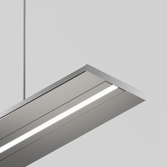
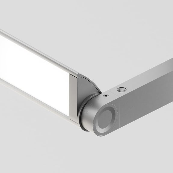
Even though the website launch was only a few months away, we successfully rendered every image needed to showcase the minimalist beauty of Vode's lighting solutions.
Vode's new product images
"Cadesign made it possible to meet our deadline"

Satisfied with the process and results
The response to the revamped website and new product renderings has been overwhelmingly positive. Visitors and customers frequently comment on the website's beauty.
"99% of the time, the first thing people say is, 'Your website's beautiful,' and so much of that has to do with the renderings. We were so satisfied with the results and the whole process, which was really positive from start to finish, that we decided to move forward with Cadesign for all our future product launches," says Melanie Sanders.
The importance of consistency and timeliness
When presenting their products side by side, Vode requires that all the images are visually consistent to emphasize the minimalist look and feel of the product. This consistency is achievable with CGI and the fact that Vode has the same 3D artist working on all their renders.
"It's a huge benefit to collaborate closely with somebody who knows us, knows what we're trying to do, and understands our products and how they're used. The steps from start to final image have gotten a lot shorter because we know our 3D artist at Cadesign and what he needs from us - and he knows what we like," says Melanie Sanders, and continues:
"We work with very short deadlines that we cannot just move around. When a new product is set to launch, it's going to launch, and we need to have our marketing materials, including our 3D renderings, ready. And Cadesign delivers before that deadline every single time. It's a huge relief that I don't have to worry about getting the materials on time."
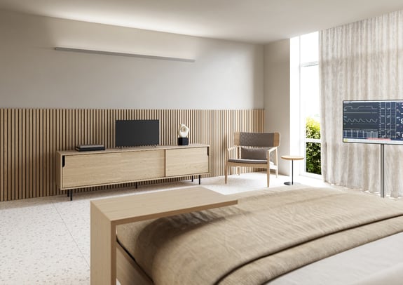
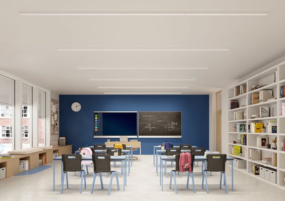
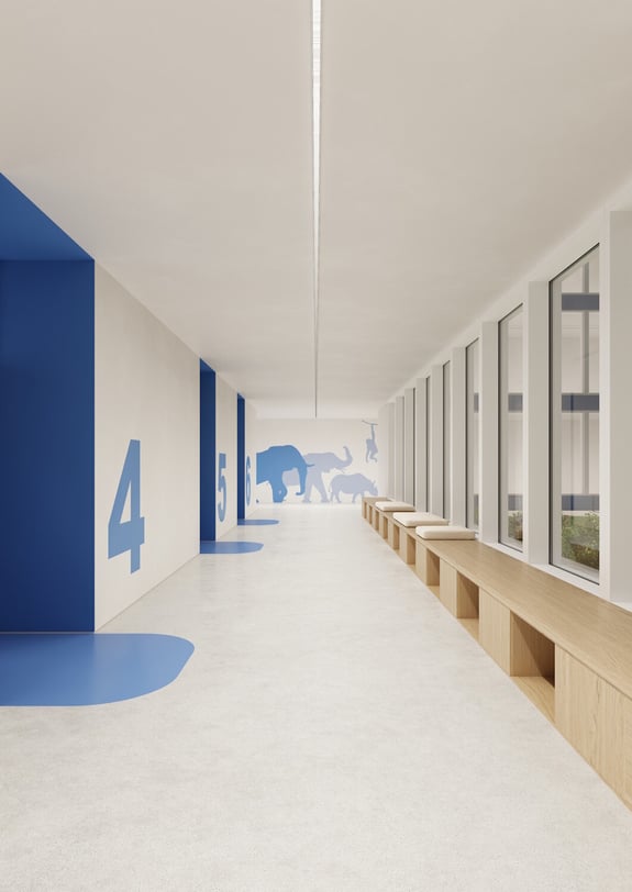
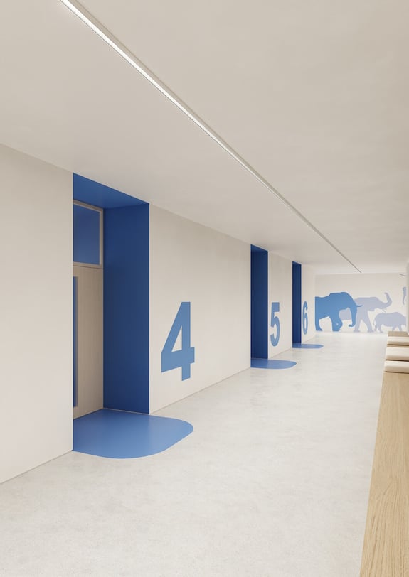
Highlight the beauty of minimalist design
"Great to work with"

Industry-specific examples
Visit our industry-specific pages, where we've curated the best images, films, and product configuration examples from four distinct industries: Furniture, Kitchen & Bath, Building Materials, and Industrial.


